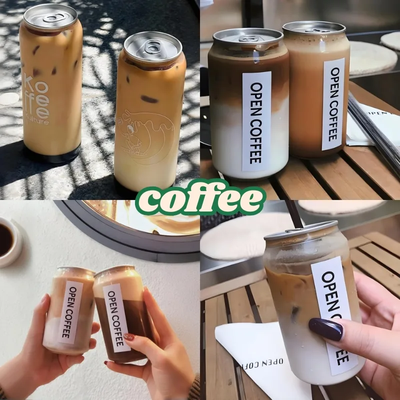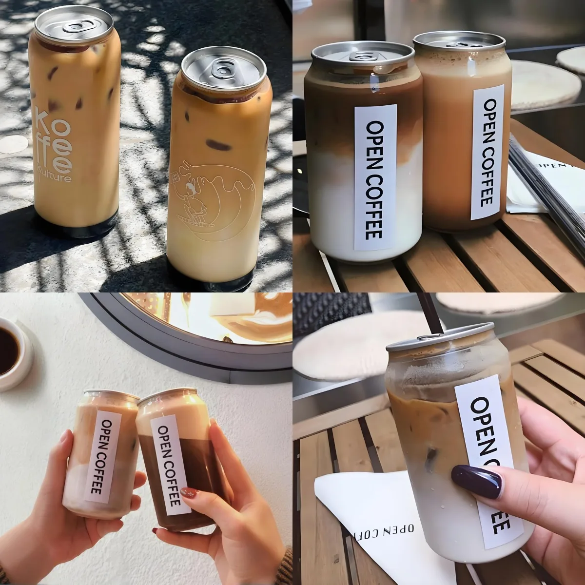
Seven or eight drink options lined up in the cooler. You glance across them for three seconds, then your hand reaches for one. What just happened? It wasn’t random — it was design making the decision for you.
The global PET bottle market is worth $678.3 billion in 2026, and China alone accounts for 32% of that volume. Shelf competition has never been fiercer. But here’s the upside: if you’re using a transparent PET can, you’re already ahead. Aluminum cans can’t show the product. Paper cartons can’t show the product. Glass is heavy and fragile. Transparency is PET’s unique weapon. The question is whether you’re using it right.
The First Mistake Almost Everyone Makes: Hiding the Product
We’ve said this before, and we’ll keep saying it because brands still do it: they pick a transparent PET can, then slap a 360-degree full-coverage shrink sleeve over the entire thing.
Think about it. A consumer looking at a can of orange juice sees either a printed picture of an orange, or actual orange juice — that golden liquid with real pulp suspended in it. Which one makes them reach? The real thing. Every time. No printing press on earth can reproduce the visual of fresh juice. So why would you cover it up?
A few principles:
- Minimize label coverage. Use clear labels instead of white-backed labels wherever you can. You need brand name, ingredients, barcode, net weight — the regulatory essentials. Everything else is visual real estate you should leave to the product.
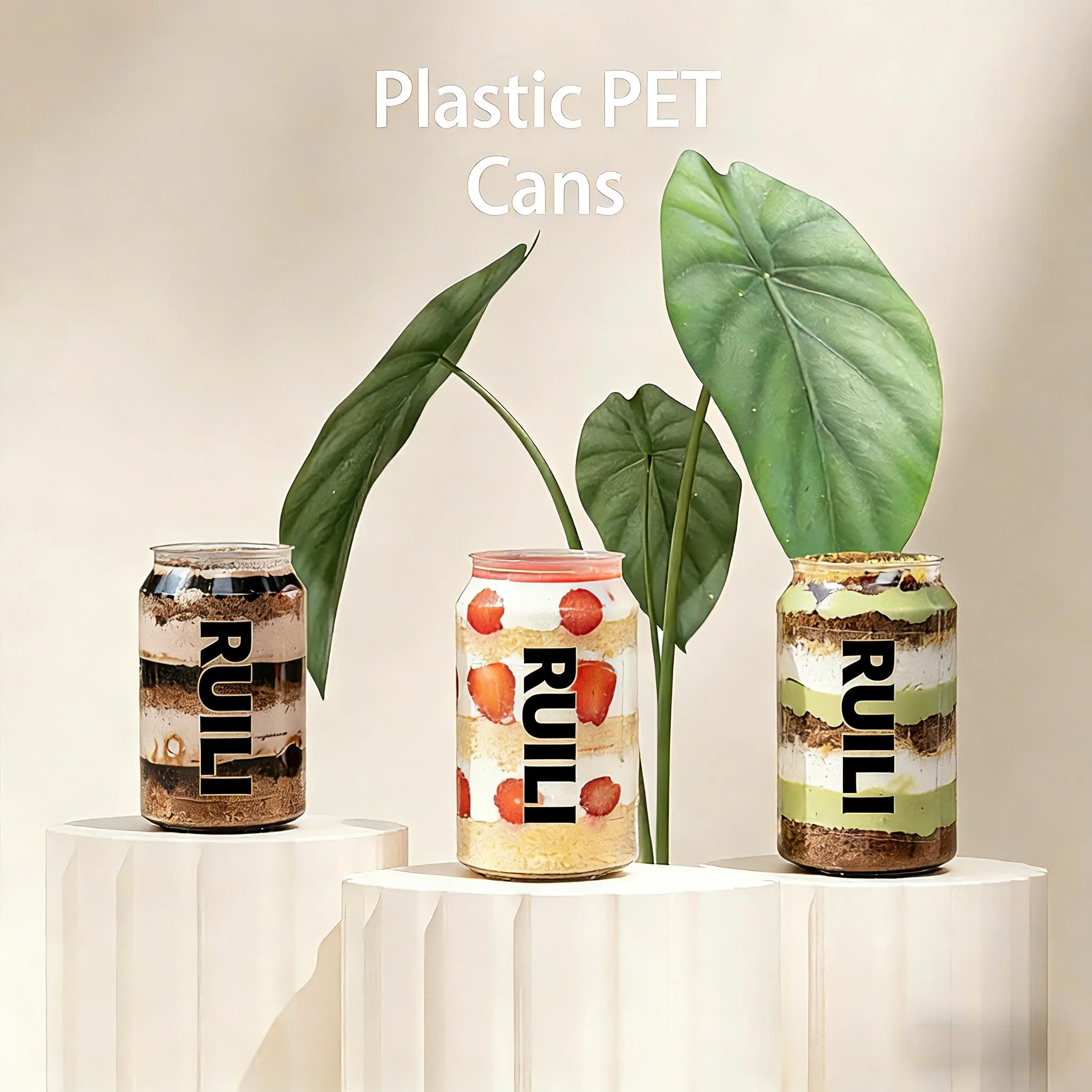
- Use layering strategically. If your drink has visual layers — tapioca pearls settled at the bottom, whole strawberries suspended in the middle, a layered latte — place your label where it doesn’t block the main attraction. Pearls at the bottom? Put the label on the top half. Fruit floating mid-can? Run two thin bands top and bottom with the middle completely clear.
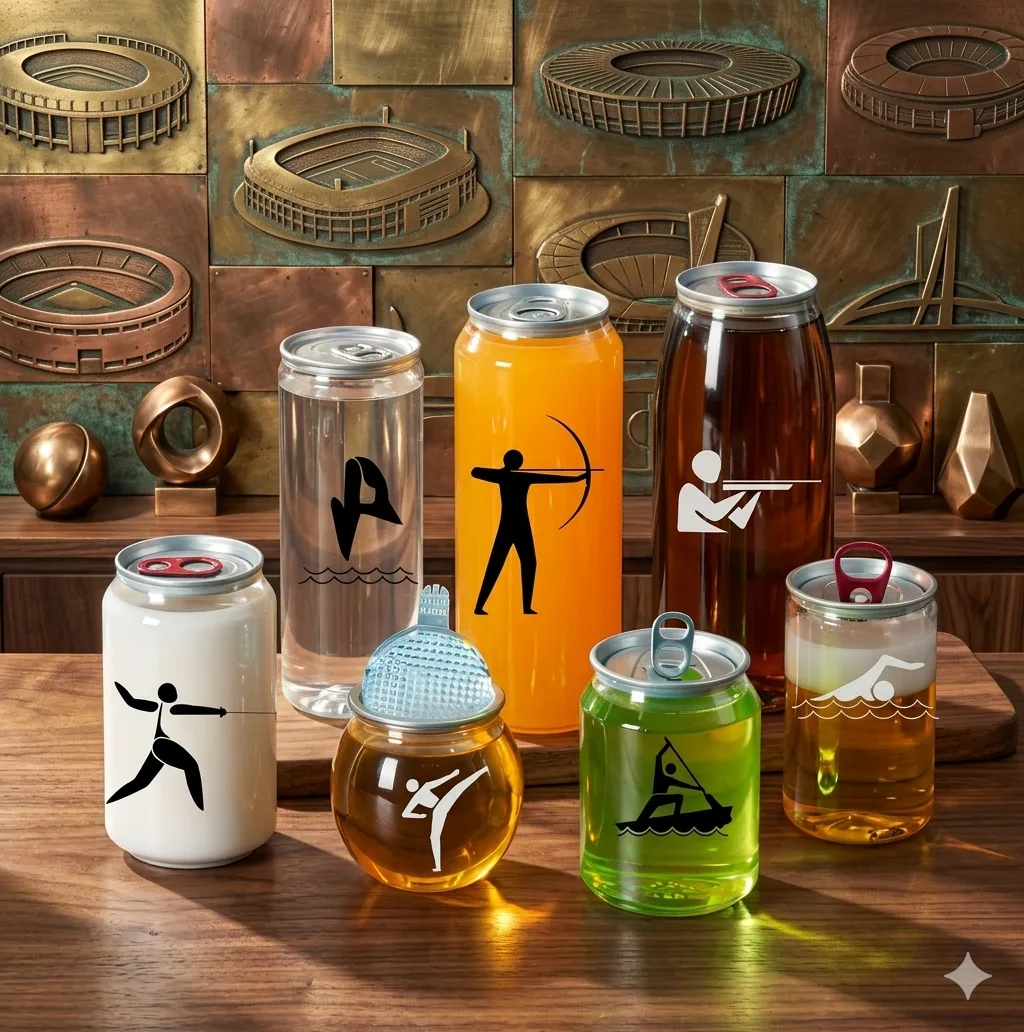
- Light-sensitive products? Go amber. Cold brew coffee and some juices degrade under UV exposure. Amber PET protects the product while keeping the semi-transparent effect. It’s a much better look than an opaque wrapper.
Lid Color Sets the Whole Vibe
The lid is one of the most overlooked design elements on a PET can, and it has an outsized effect on first impression. Picture a transparent can body and imagine the lid:
- Gold lid = premium feel. Specialty coffee, high-end tea, gift packaging. A gold lid on a transparent can instantly signals “this is the nice one.”
- Silver lid = clean, versatile, safe. Works with virtually anything and never looks cheap. The default that rarely disappoints.
- Custom-color lid = brand recognition at a glance. Matcha drink with a green lid. Berry smoothie with a red lid. Consumers spot their flavor without reading a word.
All our PET cans come with aluminum easy-open lids — it’s the mechanism consumers already know and trust. No learning curve, no frustration.
Can Size Tells the Consumer What You’re Worth
The dimensions of your can communicate more about positioning than your logo does. A consumer scans a shelf and the can size immediately tells them “this is an everyday thing” or “this is a treat”:
- 200-250ml — signals sophistication. Great for premium products, tasting samples, baby food, desserts. Consumers instinctively associate small format with higher quality, so your pricing can reflect that.
- 330ml — the standard-size anchor. It’s what people expect, what they’re used to. When in doubt, this is the safe pick. Single serving, exactly right.
- 500ml — signals value. Smoothies, meal replacements, sports drinks. Consumers see a bigger can and mentally register it as a better deal.
- 750-1000ml — shareable format. Cold brew concentrate, family-size juice, party scenarios.
Don’t just match the can size to your product volume. The same net content in a tall slim 250ml can versus a squat 330ml can — consumers will pay different prices for these. The form factor itself shapes perceived value.
How to Combine the Four Decoration Methods
We’ve got a full article on decoration options, but here’s the design-perspective summary:
- Shrink sleeves done right create layered, dimensional packaging. Done wrong, they defeat the purpose of using a transparent can. Remember the window.
- Digital direct printing is your friend when you’re testing designs. No plate costs means no penalty for changing your mind.
- Hot stamping is the accent piece — a single gold foil logo on an otherwise bare transparent can is effortlessly elegant.
- Screen printing gives you thick, opaque color. Best for brands with a simple, stable visual identity.
One more option worth mentioning: frosted finish. If full transparency doesn’t fit your brand but you don’t want to cover the can either, a matte frosted surface gives you that semi-transparent, diffused look. You can still see the product, but with a soft, premium haze. This works beautifully for still water, sake, and any clear-liquid product that benefits from understatement.
Designing for E-Commerce
More and more beverages are selling online. Your can has to look good on a shelf, yes — but it also has to look good in a delivery box the moment someone opens it:
- Transparent PET cans photograph naturally well. Bright liquid colors, clean product visibility — click-through rates on e-commerce product pages are consistently higher for transparent packaging than opaque alternatives.
- Your can needs to survive shipping. PET’s impact resistance blows glass out of the water, and that matters for e-commerce fulfillment. Nobody wants a refund request because the box arrived full of broken glass and sticky liquid.
- The unboxing moment is worth designing for. Open the shipping box and see neatly arranged transparent cans, the product colors doing all the visual work — that’s a stronger first impression than any marketing copy you could write.
Sustainability Marks Aren’t Footnotes — They’re Selling Points
PET dominates the global bottle market with 68% share, and 73% of that goes into food and beverage packaging. PET is already in mainstream recycling streams — that’s a genuine advantage. How do you design around it?
- Put the #1 PET recycling symbol somewhere visible. Not hidden on the bottom. Put it on the front label. Consumers care about this more every year, and they’re looking for it.
- If you’re using rPET, say so and say how much. “This package contains 50% post-consumer recycled PET” — that’s not a disclaimer, it’s a brand credential. rPET has a carbon footprint 79% lower than virgin PET. Most consumers won’t know that exact number, but “more sustainable” is a message everyone understands.
- Use less ink. Minimalist design isn’t just an aesthetic choice — it genuinely makes the package easier to recycle. A transparent can with just a logo and essential info moves through the recycling stream far more cleanly than a fully wrapped, heavily printed alternative.
Here’s a telling case study: in 2022, Sprite switched its iconic green PET bottle to clear PET — specifically to improve recyclability. Colored PET causes problems in sorting facilities; clear PET has much higher recovery value. The move signaled something important: recyclability is now a design consideration, not an afterthought. If Coca-Cola is willing to give up a brand color that defined Sprite for decades, the direction of the industry is unmistakable.
The US recycling picture makes this even more relevant. Seven of thirty PET recycling facilities in the country have shut down, and America’s PET recycling rate sits at only 25%. Brands that design for recyclability — clear PET, minimal labeling, rPET content — are positioning themselves ahead of a supply chain that’s actively contracting.
What We Actually Do for Brands
CHINPK isn’t just a can manufacturer. Over seventeen years, we’ve helped hundreds of brands think through their packaging design:
- Free design consultation — your product category, your positioning, your budget. We help you figure out the right can size and decoration approach before you spend money on something that doesn’t work.
- 3D renderings — before you commit to production tooling, see what your can actually looks like from every angle. Much more useful than a flat 2D mockup.
- Physical samples with your actual product inside — see how it photographs, how it feels in hand, how it performs on a real shelf. No surprises after production starts.
A lot of brands spend serious money on design only to discover that the can looks different in person than it did on a screen. Prototyping upfront saves the expensive mistakes later.
Tell us about your product and we’ll help you think through the design. No pressure to order — let’s get the concept right first. You can also check out examples of our work — there’s a good chance we’ve done something similar to your category.